I used to work for a company that sold software to bounce house rental companies where I created all sorts of website templates for our customers. Bright and bold colors were used throughout along with playful fonts and illustrations. The intention was to look like a Toys R Us catalog or a Fisher Price box. After all, most of the customers were parents looking to rent bounce houses for their kids' birthday parties, so whimsical and fun branding was what we were going for.
Last week, OpenAI unveiled GPT-5 and much was made of their chart crimes, but a different kind of chart crime happened during that presentation that many missed. They were trying to showcase how the new model could generate a fancy dashboard with a simple prompt and then proceeded to put this abomination up on the screen:
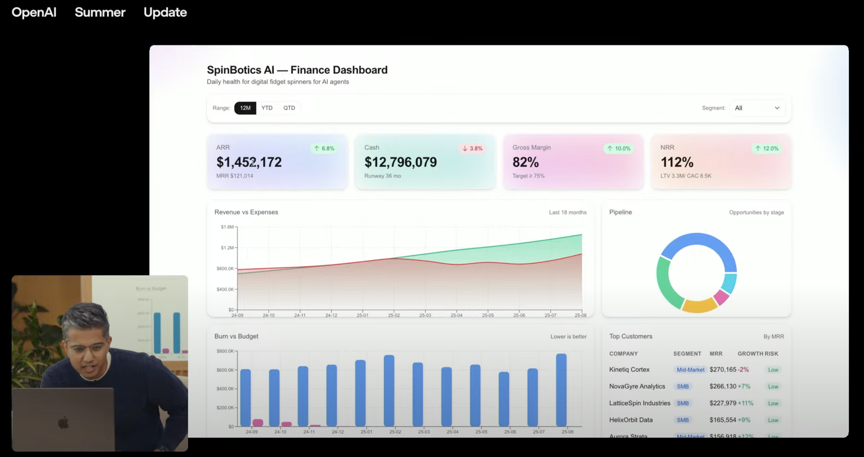
When have you ever seen a dashboard in real life that looks like that?
- 15 different neon colors, many of them clashing.
- Text contrast issues abound.
- Ugly looking gradients for no reason.
- An inconsistent design language.
- No visual hierarchy, everything competes for your attention.
It would be like if I was trying to make a dashboard in the style of bounce house websites but had only started learning front end 2 hours ago and had also just suffered a very serious concussion. Now as a very rough first iteration or proof of concept this is fine, but OpenAI wants you to believe this garbage should actually pass as a finished product.
It resembles a Fisher Price box more than professional software, so I'm officially coining "Fisher Price UI" to describe this design style.
Unfortunately, this is the level of quality that every AI slop generator (Bolt, Replit, Base44, ect.) farts out. Fisher Price UIs are immediately recognizable with some very noticeable tells.
❤️ ✅ Emojis 🥳 ✨
Before two or three years ago did you ever see emojis in landing page copy or as a drop-in replacement for real icons in a software UI? No, of course not, they look extremely unprofessional and are unsuitable to use on a serious product.
Bisexual lighting
A pink to blue gradient, often referred to as "bisexual lighting," is present in many AI generations. Gradients can add a lot to a design if used subtly and tastefully but AI doesn't have any real taste so it ends up adding garish and tacky gradients everywhere.
Hover effects that serve no purpose
Adding a hover effect or animation to an interactive element can give a visual cue to a user that they can interact with it. For some reason, AI generations include hover effects on virtually everything even if they're not interactive.
Is there any reason for a simple card with some copy to change colors or enlarge when a cursor hovers over it? No, and in fact it has a psychological effect where the user perceives the element to be interactive even though it's not.
Questionable use of shadows
Adding a shadow to an element gives it depth and can make it distinct from its background. AI has a tendency to overuse shadows and makes them larger and darker than necessary. If everything has a shadow or the shadows are too pronounced then it just becomes visual noise that at best doesn't serve any real purpose and at worst distracts and reduces legibility.
Typography issues
Numerous books have been written on effective typography that I won't attempt to summarize here but suffice it to say AI almost never adheres to any best practices when it comes to type. Casing, weight, font size, line height, letter spacing, color, balancing, content width, and more all play a part in great type.
AI will make the same mistakes over and over with regards to these things. I'm wondering if it's a training issue since there's so much terrible typography on the internet so the majority of the data it's trained on is bad. If that's the case, I don't expect these issues to be resolved any time soon.
Can this be fixed?
AI approximates principles of good design but has no capability to put them together in a cohesive way. Instead, you just get a careless mishmash of "good design" on an atomic scale but without any consideration of how all the elements work together. Typically, this is known as "bad design".
I'm not optimistic this poor state of AI generated UI will improve all that much. If more people continue to "vibe-code" apps, these patterns will show up more in AI training data and create a smoothing effect where terrible UI practices are reinforced. Not a bright outlook in my opinion.
This article was authored without the use of generative AI